This week's reading certainly brought us forward into present day. Topics like the digital revolution, computer aided graphic design, and design for mobile devices were covered. Many modern day examples of graphic design were featured in our text, and one set that stuck out to me was the feature on "Mad Men", the TV drama that is aired weekly on AMC. The sequence of images is from their title design, and won an Emmy for Outstanding Title Sequence in 2008. I had no idea that Emmy awards were given for title sequences before our reading this week, but having seen the title sequence, I can understand why it won - it's very visually interesting.


I've watched the show and while I am not an avid fan, I do like it, and enjoy its premise, its quality in reproducing retro / vintage looking scenes and I can see why it's such a popular show. The title sequence is very interesting to watch. It's always been one that I never fast forward through when I am watching recorded episodes - it has a fun and catchy soundtrack combined with very visually appealing graphics that make it appear that the silhouette of the main character, Don Draper, is falling from a tall city building and you see many interesting advertisements and photographs as backgrounds and even office interiors as he falls. These PRINT Mag articles (here, and here) by Stephen Heller also give some great insight into the concept behind the sequence, as well as where some of the influence for the design came from - and where it didn't.
This YouTube video is from PBS's show OffBook, and is really interesting. (Warning - some gory zombie scenes are included) It contains the Mad Men sequence, but also has examples of other title work and interviews with some of the designers from Imaginary Forces - the studio behind Mad Men's award winning title sequence. The video also shows some of their other work and explains their intentions and how they come up with a good design concept for a title sequence. Imaginary Forces is also the studio behind the work on title sequences seen on films such as Seven, Tranformers, Twilight Eclipse, and TV shows such as Boardwalk Empire, Smash and South Park. They have a strong portfolio of commercial and video game work too.
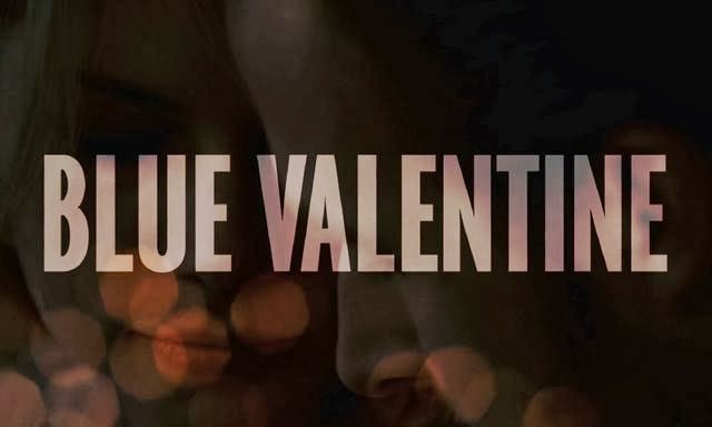
I hope you watch the video - it's short, less than 7 minutes, but really gives an interesting overview about title sequences, why they are so important and how the designs for great title sequences are created, from conceptualization to production and how some designers try to push the boundaries through typography or digital image composition to create something new, cutting edge and visually interesting for the viewer. It also includes interviews with Ben Conrad who created the title sequence for the film Zombieland and Jim Helton, who created the title sequence for the film Blue Valentine.
 |
Before this research, inspired by this week's lesson and reading, I had no idea how important title sequences are. I never thought about them, how they differed from one another or even which ones were great and / or memorable. Title sequences really set the stage for the viewer and draw the viewer into a new world with fantastic combinations of typography, visual design and art. The amount of creativity in title design is really amazing to me - this site, Art of the Title has an extensive collection of incredible title designs.
I am thrilled by the dedication of many of the designers to push the envelope, please the audience and capture imaginations through their work. This article also provides a great background on title sequences (specifically for films) and their importance, and how often they are an ignored art form. I have to say, I really found this sliver of the graphic design industry and community interesting. Very interesting. In fact this is a career path I would love to follow and plan on looking into in the near future. I'm amused that a portion of the graphic design world, that I ignored and neglected before this class and even before this week, is now something I find so fascinating that I am considering pursuing it as a career. But I think that it is an important and effective part of graphic design, and great title sequences are memorable - after all, can you imagine a James Bond film without it's famous title sequence? Neither can I.
Sources:
http://www.youtube.com/watch?v=uA0QTfZ4LPY&list=TLu1Z5BjCqJKc - YouTube "Mad Men" full title sequence
http://www.printmag.com/daily-heller/mad-men-intro-title-sequence/ - Print Mag article on Mad Men title design
http://www.printmag.com/daily-heller/separated-at-birth-falling-man/ - Print Mag article on design featuring falling man
http://www.imaginaryforces.com/ - Imaginary forces website, information about creative concepts behind Mad Men and other designs, stills from Mad Men title sequence
http://www.youtube.com/watch?v=qbhi-JICKKI&list=PLC3D565688483CCB5&index=37 - YouTube video source for OffBook video about Film & TV title design
http://www.artofthetitle.com/designer/ben-conrad/ - Biography of Ben Conrad, founder of Logan
http://www.artofthetitle.com/title/blue-valentine/ - Information about Blue Valentine title sequence
http://www.artofthetitle.com/ - website collection of title sequences
http://www.denofgeek.us/movies/18511/the-importance-of-title-sequences-in-the-movies - article on the importance of title design
No comments:
Post a Comment